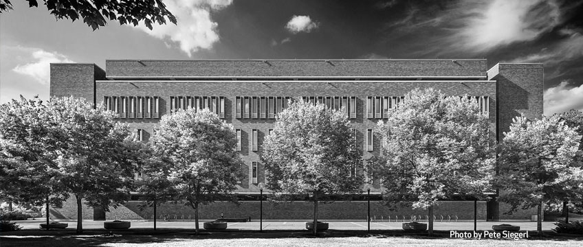
Pete Sieger’s striking black-and-white images of the University of Minnesota’s West Bank campus invite a fresh look at unheralded midcentury architecture
By Jane King Hession
“We tend to see things without really seeing them,” says architectural photographer Pete Sieger. “Most of us move through our daily lives without stopping to reflect on the quality of our environment.”
Case in point: On any given day, scores of people walk, run, or bike through the heart of the University of Minnesota’s West Bank campus. One heavily traveled route winds its way past four of the earliest buildings constructed on the new campus when the U jumped the Mississippi River in the early 1960s. The brick facades of the 12-story Walter W. Heller Hall (1961) and its near twin, the 15-story Social Sciences Building (1962), both designed by Cerny Associates, are characterized by a rigidly (some might say relentlessly) rhythmic pattern of windows.
To the south stands the enormous bulk of the O. Meredith Wilson Library (1968, also by Cerny Associates), the largest of the university’s 13 libraries. Collectively, the three structures dwarf Blegen Hall (1962), a relatively diminutive four-story building by Setter Leach & Lindstrom, which is linked to Heller Hall and Social Sciences via triple-decker, glass-walled skyways. Although the four buildings continue to be well used, they are not well loved. It’s unlikely they would make anyone’s list of the best University of Minnesota buildings. They are benignly ignored by most and reviled by some. But Sieger thought they merited a closer look—through the lens of his camera.
Sieger was familiar with the buildings, but he hadn’t given them much serious thought himself until recently. As he traveled back and forth to the U along Washington Avenue this past summer, the Heller and Social Sciences towers caught his eye. “I liked the fenestration, which in a way seemed like a throwback to what Mies [van de Rohe] was doing with glass and steel, in terms of proportion and rhythm,” he says.
The massing of Wilson Library reminded him of something else: the imposing forms of Brutalism, an architectural movement that prevailed when Sieger was an architecture student at the U in the late 1960s and early 1970s. It struck him that the buildings—in their variety, contrast, and balance—would make a compelling photographic study. “Photographs can go beneath the surface of what one might casually see,” he says.
His artistic vision for the study was inspired by the black-and-white images of noted architectural photographers Ezra Stoller and Balthazar Korab of now iconic midcentury buildings. “Black-and-white adds a timelessness to whatever you are shooting,” says Sieger. In the absence of color, the image tends to be “less literal and more abstract, and I believe abstraction is a superior way of photographically representing design elements in architecture,” he adds. Unlike Stoller and Korab, Sieger shot the original images in color and later digitally converted them to black-and-white.
Aesthetically, Sieger favors high-contrast images because “contrast is an effective way of modeling texture, form, and space.” To that end, when shooting the buildings, he used a polarizing filter to darken the sky and heighten contrast between it and the tonally lighter structures. According to Sieger, that juxtaposition of dark and light “enhances the representation of a building’s form . . . in a way that places the focus squarely on the architecture itself.”
He was also intrigued by the idea of starting with “vignettes” or close-ups and progressively moving to wider shots of the buildings—a technique he recently put to the test in Barcelona (“Barcelona in Focus,” November/December 2013 issue). “There’s more drama in seeing pieces of the whole before revealing the whole. It’s like solving a mystery,” he says.
Although Sieger had no preservation agenda in mind when he photographed the buildings, his powerful and provocative images urge a second look at the underappreciated structures, which he argues are “competently designed and capably done.” While he acknowledges that the Frank Gehry–designed Weisman Art Museum (1993) brought “spice and variety” to a campus previously dominated by “brick boxes,” Sieger favors a balance between architectural superstars and stalwart citizens.
“There is a place for modest buildings that have stood the test of time,” he notes. There is also a place for imagery that helps us to better understand our surroundings. By nature of its focused view, “architectural photography offers another way of seeing and interpreting the world around us,” says Sieger. He hopes his photographs will encourage viewers to slow down, step back, and look more closely at the landscapes of their lives.


